

Structure, Rhythm, Color
The fundamentals behind
great websites
 8 min read

A good website earns trust before anyone starts reading. Clear structure, consistent spacing, and thoughtful color make a page easier to follow and faster to understand.
When a homepage feels wrong, the problem usually starts with the layout. Too many elements compete for attention. Sections feel unrelated. The page gives no clear place to begin.
Before choosing colors or adding effects, I reduce the page to its basic parts. I look at the grid, the spacing, and the order of the content. The main idea should be obvious. Supporting details should sit beneath it without fighting for the same level of attention.
This becomes easier to judge when the page is shown in grayscale. Without color to distract you, weak decisions become clear. You can spot crowded sections, uneven spacing, and headings that do not match their importance.
The layout should also hold together when the content changes. A short heading may become two lines. A paragraph may grow. A new section may need to be added later. Good structure allows those changes without forcing the entire page to be redesigned.
Before moving on, I ask:
- Is the page easy to follow?
- Does every section need to be there?
- Can someone tell what matters most within a few seconds?
When the answer is no, adding polish will only cover the problem. Fix the layout first.
Rhythm gives the page its pace
Once the structure is clear, I focus on spacing.
The distance between a heading and its paragraph affects whether they feel connected. The space between sections tells the reader when one idea has ended and another is beginning. Small changes here can make a page feel either smooth or tiring.
Consistency matters more than variety. Body text should use the same line spacing throughout the page. Similar headings should have similar margins. Images, buttons, and text blocks should align with the same grid.
That does not mean every section needs the same amount of space. A short statement may need more room around it. A detailed section may need tighter grouping so the content stays connected. The goal is not to use one measurement everywhere. The goal is to make the spacing feel deliberate.
Many sites become harder to read because every section tries to look different. One block is centered, the next is left aligned, then the type changes, followed by a completely new layout. Each change asks the reader to understand the page again.
A repeated pattern removes that effort. People can focus on the content because they already understand how the page behaves.
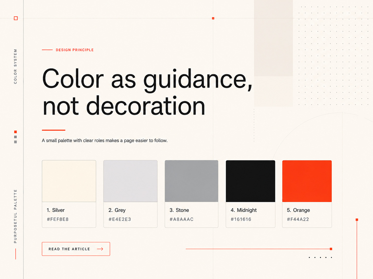
Color as guidance, not decoration
I leave color until the layout already works without it.
A page should still feel complete with a light background, dark text, and a few softer shades for borders or secondary sections. Starting with a limited palette makes it easier to judge whether the design is relying on color to hide weak structure.
Brighter colors come later, and each one needs a clear purpose.
An accent color can point to the main action on a page. It can show which link is active. It can separate an important message from the surrounding content. When the same bright color appears on buttons, headings, icons, labels, and backgrounds, that meaning disappears.
Color also affects how people read a page. A red button can feel urgent. A soft blue may feel familiar or dependable. Green can suggest nature, health, money, or success depending on where and how it appears.
That's why I test color in context rather than choosing it from an isolated sample. I place it beside the actual text, background, buttons, and images. I also check whether the contrast remains clear on different screens and in both light and dark settings.
The best palette is rarely the largest one. A few colors used consistently usually create a stronger result than a long list of shades with no clear role.
Simplicity over cleverness
I often return to an essay on grugbrain.dev about keeping systems simple. The lesson applies to websites just as well as software.
A page becomes difficult to maintain when every section follows a different set of rules. One heading uses a unique size. One button has its own behavior. One layout only works for a single campaign. These choices may look interesting in a mockup, but they create problems once the site begins to grow.
I prefer a small set of patterns that can be reused. Headings follow one clear scale. Sections share the same spacing rules. Buttons behave the same way across the site. New pages can be added without inventing a new system each time.
This also helps performance. Large scripts, heavy effects, and unnecessary animations can make a page slower without making it more useful. Each addition should earn its place.
Removing something does not automatically make a design better, but it often reveals what the page actually needs. A shadow may be unnecessary if spacing already separates two sections. An animation may add little if a simple state change explains the interaction clearly. A long paragraph may be easier to understand as three shorter ones.
Simple design still requires care. In many cases, it requires more care because there are fewer details available to hide weak decisions.
The goal is not to make the page plain. The goal is to make every choice easy to understand.

How I choose bright colors
People often ask where the brighter colors on my sites come from. I usually find them outside, not on a trend board. When a page needs an accent, I go for a walk and look for the color I already have in mind.
It might come from a leaf, wet bark, moss, or a flower. I take a photo, bring it into Photoshop, and sample from it. Then I adjust the color beside the actual background, text, buttons, and charts.
The color has to remain clear wherever I use it. It should work on a button, a link, or a thin line without becoming harsh or disappearing.
This keeps the palette connected to something real. I know where the color came from, and I know why it belongs on the page.
What makes a site feel complete
People form an opinion of a website before they read very much. They notice whether the page loads quickly, whether the content is easy to scan, and whether the next step is clear.
Those early impressions come from ordinary decisions. The layout gives the page order. Spacing separates ideas. Color directs attention. Type makes the content readable. Performance keeps the experience from getting in the way.
None of this depends on a trend or a specific framework. The tools will change, but the basic questions remain the same.
- Can someone understand the page without studying it?
- Can they move through it without getting lost?
- Does every section support the purpose of the page?
- Does the site still feel clear on a phone, a slower connection, or a smaller screen?
My process begins by removing as much as possible. I arrange the content, set the spacing, and make sure the page reads well without decoration. Then I add color, images, and interaction where they improve the experience.
By the end, the design should feel natural rather than impressive for its own sake. People should be able to use the site without thinking about the decisions behind it.
That's usually the best sign that those decisions were made well.
Cavendish Pierre-Louis
Co-founder & CEO at Redovar