

10 rules for building a high-
performing website
 8 min read

This is the checklist I use whenever I build a site. It helps me decide what belongs, what should be removed, and whether the page is clear, fast, and easy to use.
1. Structure comes before beauty
A page should make sense before it looks impressive. I begin with the order of the content. The main message comes first. Supporting details follow. Every section should have a clear reason to be there.
I often review the first version in grayscale. Without bright colors, photos, or effects, it becomes easier to notice weak spacing, unclear headings, and sections that compete for attention.
Once the page is easy to follow, the visual details become easier to add. Color, type, and images should support the layout, not try to fix it. A strong design begins with clear structure.
2. Every pixel has a job
Every detail should help the page. A line can separate two ideas. A shadow can show depth. Motion can make a change easier to follow. When a detail does none of those things, it probably doesn't need to be there.
When I review a design, I remove elements one by one and watch what happens. If the page becomes clearer, the element was getting in the way. If something important becomes harder to understand, it stays.
This does not mean every page has to look plain. It means every choice should have a reason. Good design is not about adding more. It's about knowing what to keep.
3. Clarity is the highest form of luxury
To me, luxury on the web means never feeling lost. You know where to look, what matters, and what to do next. The page does not make you stop and figure it out.
That comes from clear writing, consistent headings, and familiar patterns. Fewer colors and fewer distractions leave more room for the message.
When I simplify a design, I am not trying to make it empty. I am removing anything that makes the page harder to use. The best websites feel clear without feeling basic.
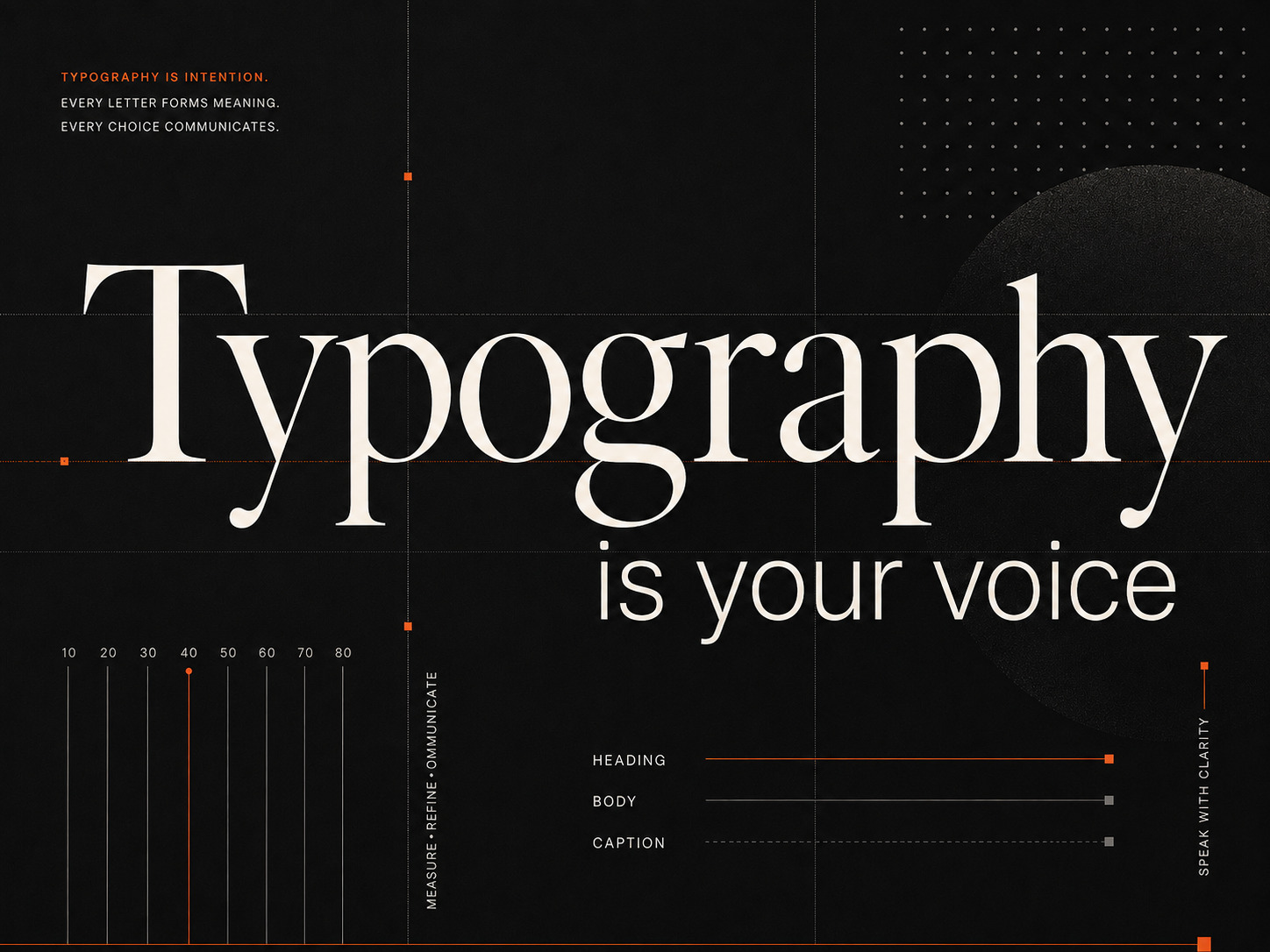
4. Typography is your voice
Most websites are made of words, so the type matters. It shapes the tone of the page before anyone starts reading. A font can make a brand feel warm, serious, direct, or playful.
The order should be clear at a glance. Headings, body text, and captions need enough difference in size and weight to show what matters first. I keep the scale small and use it consistently.
I choose type based on the character of the brand, not what is popular. Once it is set, I do not keep changing it. A few clear styles used well are stronger than a page full of variations.
5. Spacing sets the pace
Spacing controls how quickly people move through a page. The distance between a heading and its text shows what belongs together. More space between sections marks the start of a new idea.
The pattern should stay consistent. Similar headings need similar spacing. Paragraphs should follow the same line height. Images and buttons should align with the content around them.
Some sections need more room than others, but the changes should feel deliberate. When everything is crowded together, reading becomes tiring. Good spacing makes even a long page easier to follow.
6. Small details build trust
People notice how a site behaves. A button should respond clearly. A menu should open without delay. Scrolling should feel smooth from one section to the next.
The same care should carry into links, forms, and error messages. When someone makes a mistake, the page should explain what happened and help them fix it. These details may seem small, but they shape the whole experience.
A site should feel dependable even when nothing dramatic is happening. That is where good design proves itself.
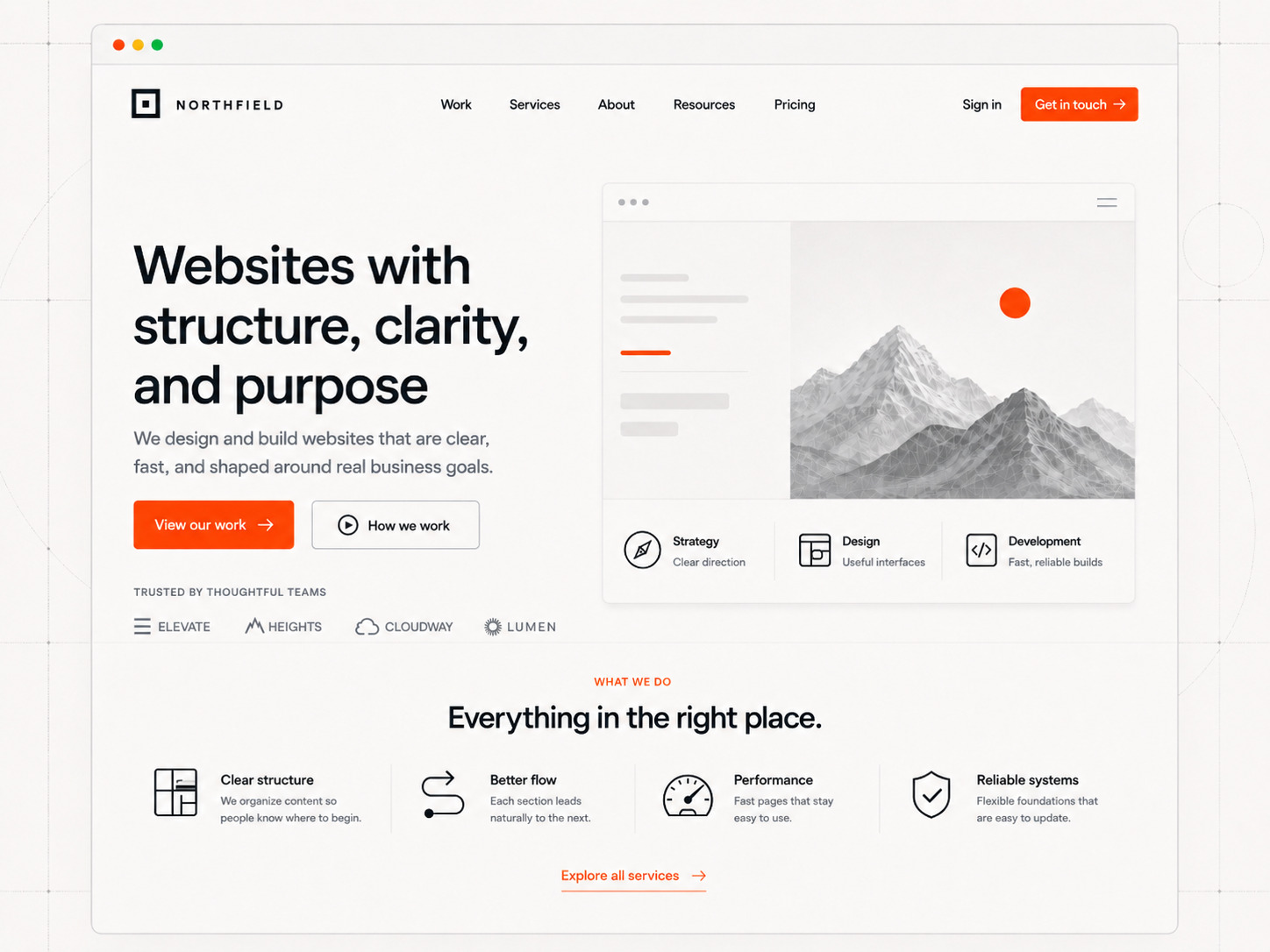
7. Pages should read like chapters
Each page should have a clear purpose. It should answer one main question, present the information in the right order, and lead naturally to what comes next.
I plan a site by looking at the full journey. The homepage introduces the idea. Other pages explain the details, answer common questions, or help someone make a decision. No page should feel disconnected from the rest.
The next step should always be clear. That might be opening another page, contacting the company, starting a trial, or simply continuing to read. A well-planned site helps people move forward without making them search for the way.
8. Speed is part of the experience
A website should load quickly and respond without delay. Performance is not something I leave until the end. It affects whether people can read the page, move through it, and finish what they came to do.
Every image, script, and library adds weight. I review each one and ask whether it improves the page enough to justify the cost. Large images get compressed. Unused code gets removed. Effects that slow the page down do not stay.
The goal is not a perfect score. The goal is a site that feels fast on a phone, on a slower connection, and for someone who does not have time to wait.
9. Make the site feel like the brand
Too many websites look interchangeable. They use the same layouts, colors, and design choices because those patterns are popular. The result may look polished, but it says very little about the people behind it.
A website should reflect the company it belongs to. The writing, type, images, and small details should all feel connected to the same point of view.
I don't design around what happens to be popular. I look at the brand, the people, and what makes them different. The strongest sites are not the ones that follow every trend. They are the ones you could recognize without seeing the logo.
10. Leave room for change
A website should be able to change without falling apart. New pages get added. Copy grows. Products change. The design should make those updates easier, not force a rebuild every time.
I use simple layouts, reusable sections, and clear content structures. That gives the site room to grow while keeping everything consistent.
A launch is only the beginning. The stronger the foundation, the easier the site is to update, improve, and keep useful over time.
The standard I build by
These ten rules come back to one idea: make the page clear, useful, and easy to trust. Every choice should help people understand the content and move through the site without getting in their way.
Trends will change. The basics will not. That is the standard I bring to every site I build.
Cavendish Pierre-Louis
Co-founder & CEO at Redovar