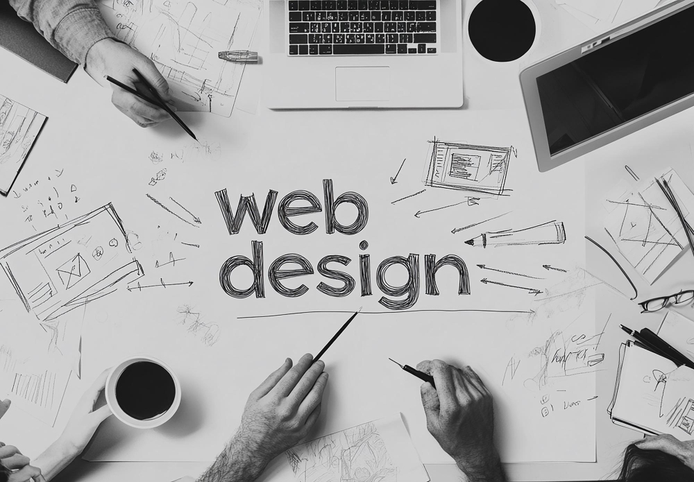
Why structure comes first
When someone tells me their homepage “does not feel right”, they rarely describe color or type first.
They talk about a vague sense of clutter. They say the page feels heavy, or noisy, or like everything is shouting at once.
Almost every time, the problem lives in the structure long before we talk about visual style.
Structure is the quiet skeleton under every page. It is the grid that decides how far elements sit from one another. It is the hierarchy that says which idea deserves the biggest, boldest line and which idea is just a whisper in the corner. It is the spacing choices that tell a visitor whether they are safe to explore or about to be ambushed by popups and distractions.
I like to start simple.
One column for reading.
Clear gutters so text can breathe.
A base size for body copy that feels honest on both a laptop and a phone.
From that baseline, I let the grid do most of the heavy lifting.
I reserve wide spans and full bleed moments for things that really matter, not every new idea that passes through a marketing meeting.
Trust starts here.
A stable layout tells people that someone cared enough to line things up.
Misaligned cards, inconsistent padding, and random font sizes tell a different story.
Visitors might not be able to explain why a site feels unprofessional, but their nervous system notices.
If the UI looks shaky, they will assume the backend and the business processes are just as unstable.
When I audit a site, I look at structure long before I open the color inspector.
I strip the page down in my head and ask three basic questions:
- Is there a clear path from top to bottom that a tired person could follow without thinking very hard?
- Does every section earn its place on the page, or is the layout carrying dead weight?
- Can I describe the hierarchy in one sentence, or does it require a diagram just to explain what matters?
If those answers are messy, it does not matter how nice the gradients look. A chaotic structure always leaks trust.
Rhythm is the pacing people feel but rarely name
Once the structure is honest, I pay attention to rhythm.
Rhythm is the pacing of a page.
It is the distance between headings and paragraphs.
It is the way sections rise and fall as you scroll.
Good rhythm makes a long article feel like a walk.
Bad rhythm makes even short content feel like a staircase that keeps changing height.
On a practical level, rhythm is repetition. Body text uses one line height. Section titles share a consistent margin above and below. Buttons line up on the same baseline instead of floating wherever the component library decided to drop them. The more repetition the layout carries, the calmer the experience becomes.
I think of vertical rhythm like breathing. A tight cluster of text and images is an inhale. A generous band of space before the next section is an exhale. If a page keeps inhaling with no room to release, people feel it as tension. They might not close the tab right away, but their shoulders creep up a little.
Designers sometimes fight this idea. There is a temptation to make every section look unique so nothing feels boring. The problem is that every new pattern costs attention. If each block changes alignment, spacing, and typography, the brain spends all its energy learning the layout instead of reading the message. A calm rhythm lets visitors predict the next beat. Once they trust the pattern, they can relax and focus on the content.
Color as guidance, not decoration
Color is usually the first thing people want to talk about when they start a redesign.
It is also the part I delay as long as I can.
Color is powerful.
It can rescue a disciplined layout or destroy it in two clicks.
When I finally open the palette, I treat color as guidance, not decoration.
My default palette is small.
One near white for the page.
One ink color for text.
One or two soft neutrals for surfaces and strokes.
If the site has to live with only those values, it should still feel complete.
That constraint forces structure and rhythm to do their jobs.
Only when the base feels solid do I start adding accent colors with very specific roles.
An accent should answer a clear question.
What needs emphasis?
Where should the eye land when someone is skimming?
Which actions are truly primary, not just nice to have?
If a color does not have a job like that, it stays out of the system.
Random highlights create noise.
Carefully assigned accents create guidance.
I also encourage people to research every color they add.
Colors carry cultural weight, brand histories, and usability constraints.
A bright red button might look bold on a mockup, but it can create anxiety if the rest of the page is neutral and quiet.
A soft green might say growth in one context and hospital in another.
Treating color like a decision with consequences keeps the palette honest.
Simplicity over cleverness
There is a short essay on grugbrain.dev that I revisit often.
It talks about the value of simple systems and the danger of clever complexity.
Even though it is aimed at engineers, the mindset is perfect for interface design.
The more clever a layout is, the harder it becomes to extend, maintain, and explain.
I try to design pages that could be implemented by a tired developer on a Tuesday night without a three hour handoff call.
That means a small set of layout patterns repeated across the site.
It means using typography scales instead of one off sizes.
It means writing components that can adapt to many use cases instead of one very specific hero for one campaign that will live for two weeks.
Simplicity also protects performance.
Every extra shadow, script, and motion effect adds weight.
Those costs might be tiny in isolation, but they add up fast.
When I choose simplicity, I am also choosing a faster page, a smaller bundle, and a better chance that the site will still feel solid on a slow connection.
It is tempting to treat simplicity as the absence of ambition.
I see it as the opposite.
Simplicity asks harder questions.
Which parts of this site truly matter?
Which details will still feel considered five years from now?
Anything that does not pass that test is a candidate for removal.

How I actually choose bright colors
People often ask where the brighter accents on my sites come from.
They expect a story about mood boards and trend reports.
Those tools are useful, but my real process starts outside, far away from the screen.
When I know a layout needs a bright color, I go into the woods.
I walk until the noise of the city fades and the palette narrows to whatever the current season is doing.
Then I look for the color I have in my head.
Sometimes it is the edge of a leaf where yellow turns to green.
Sometimes it is the bark of a tree after rain.
Sometimes it is a flower that looks almost artificial until you really stare at it.
I take a photo.
Later, in Photoshop, I sample from that image and start tuning.
I look at how the color behaves against near white and near black.
I check whether it still feels alive when it is reduced to a one pixel stroke on a button or a subtle highlight on a chart.
If it collapses under those constraints, it goes back on the shelf.
This habit does two things.
First, it keeps the palette grounded.
Nature rarely produces colors that feel cheap or harsh when you use them with restraint.
Second, it gives every accent a story.
When I apply that green to a primary button, I can remember the patch of moss or the plant that inspired it.
That memory anchors the design to something real.
How a site feels before anyone reads a word
The more projects I ship, the more I believe that people make emotional decisions about a site long before they read the hero copy.
Their first impressions come from structure, rhythm, and color working quietly together.
A strong structure tells them that someone did the hard work of deciding what matters.
Clean rhythm lets them relax into a predictable pace.
Restrained color guides them to the right actions without shouting.
Performance ties it together so the interface responds as quickly as their intent.
None of these ideas are fashionable.
They will not trend on design Twitter.
They are the boring fundamentals that keep paying off project after project.
A site that respects these principles today will still feel calm and trustworthy years from now, even as the tools and frameworks change.
When you sit down to design your next page, try this sequence.
Start by stripping away color and decoration until the layout is almost uncomfortable.
Fix the structure until it tells a clear story.
Tighten the rhythm until the scroll feels like breathing.
Only then invite color back in, one role at a time.
If you do that, you will ship sites that not only look good in a single screenshot, but feel good all the way from the first pixel to the last line of the footer.
Cavendish Pierre-Louis