Rule 1 — Structure comes before beauty
A modern website has no business looking beautiful if it cannot stand up on its own weight. I do not start with colors or effects.
I start with bones. Grid, hierarchy, and spacing decide whether a page feels trustworthy before a single gradient shows up.
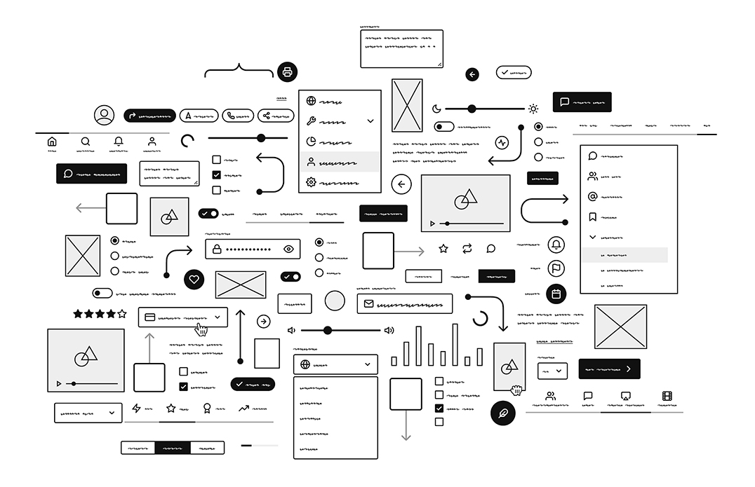
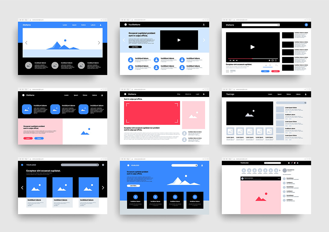
When I sketch a new layout, I imagine the entire page in grayscale. No accents, no photos, no candy.
If the structure feels calm and legible in that state, then I know the foundation is doing its job.
If I am already confused, more polish will only hide the problem, not solve it.
Beauty grows out of clear order. Sections that align, margins that repeat, headings that follow a simple scale.
Once that skeleton is solid, almost any aesthetic can ride on top of it. Reverse the sequence and you get the opposite:
a gorgeous facade on an unstable frame that collapses the moment content changes.
Rule 2 — Every pixel has a job
Nothing on the screen gets to be there “just because.” Not the extra shadow, not the decorative line, not the micro animation
that looked clever in a handoff file. Padding, margins, color, motion; each one is a decision and decisions need purpose.
When I review a page, I interrogate it the way an editor marks up a draft. Why is this element here?
What is it doing for the story? If I remove it, does the experience get clearer or worse?
Most of the time, the layout becomes sharper when I start subtracting.
A modern website is not decorated, it is composed. The difference is intent.
Composition respects the visitor’s attention and treats the interface like a sequence of deliberate beats,
not a canvas for showing off every trick the framework can do.
Rule 3 — Clarity is the highest form of luxury
People talk about luxury on the web as if it were a price point or a certain shade of beige.
To me, luxury is the feeling of never being lost. You scroll and somehow always know where you are,
what this section wants from you, and how to move forward without friction.
That feeling comes from restraint. It is the confidence to use fewer words, fewer colors, fewer flourishes.
It shows up in quiet details: consistent headings, simple language, predictable patterns.
You do not have to think about the interface, which means you can actually think about the message.
When I strip a design back, I am not trying to be minimal for its own sake.
I am trying to earn silence. The kind of silence where a person can take in information
without fighting the layout. That is what real digital luxury feels like.

Rule 4 — Typography is your voice
The web is still mostly words. How those words stand, breathe, and move on the page is your voice long before anyone hears you speak.
I treat typography like tone. It can be calm, sharp, playful, or severe. It can invite people in or push them away.
Hierarchy is sacred. A visitor should be able to squint at the page and still understand what matters most.
That means a small, disciplined scale of sizes, consistent line heights, and real contrast between headings, body copy, and captions.
Typefaces carry emotion. I do not pick them because a trend report says they are hot this year.
I pick them because they match the character of the brand and the story it is trying to tell.
Once chosen, I use them with respect, not as a playground for endless variations.
Rule 5 — Rhythm is felt, not seen
You can stare at a layout for a long time and still miss the thing your body noticed in three seconds: the rhythm.
It is the pacing between blocks, the way headings and paragraphs stack,
the cadence of dense moments followed by open space.
Good rhythm makes a long page feel like a walk.
The steps are even, the turns are predictable, and you never feel like the stairs changed height under your feet.
Bad rhythm feels like a rushed presentation: everything important is crammed together with no breaths between ideas.
When I tune rhythm, I am really tuning breathing.
Tight clusters of information are inhales.
Generous bands of empty space are exhales.
A modern website that never exhales will quietly exhaust the people using it.
Rule 6 — Build for the quiet moments first
Most people remember the big hero image or the flashy interaction from a case study.
I remember the quiet parts. How a button responds on hover.
How a dropdown opens without stuttering. How the scroll feels when you move from one section to the next.
Professionalism lives in these small places.
A subtle easing curve on motion. A clean focus state on links.
The way form fields behave when someone makes a mistake and needs help.
None of this will end up in a Dribbble shot, but it is the difference between “nice site” and
“I trust this brand with my credit card.”
So I build for quiet moments first.
If the site feels solid when nothing dramatic is happening,
the louder flourishes will sit on top of a stable base instead of trying to distract from it.

Rule 7 — Pages should read like chapters
A website is not a random stack of screens. It is a narrative.
Each page is a chapter in the story of a person discovering who you are and what you offer.
The job of the interface is to guide them from curiosity, to understanding, to trust.
When I map a site, I think in arcs. Where does this chapter begin?
What tension does it resolve? What question does it answer so the next page makes sense?
Dead ends and vague calls to action are signs that the story thread has been dropped.
The best sites feel like they are walking beside you, not pushing you through a funnel.
You always have a clear next step, even if that step is simply to pause and read.
Rule 8 — Performance is a form of respect
Fast load times, clean code, and responsible SEO are not chores I tack on at the end of a build.
They are basic hospitality. Someone is giving you their time and their bandwidth.
The least you can do is meet them with a page that shows up quickly and behaves well.
I keep an eye on weight the way a pilot watches fuel.
Every script, every library, every oversized image gets questioned.
If it does not meaningfully improve the experience, it does not ship.
Performance is not about chasing a perfect score.
It is about respect. A fast site tells people their time matters.
A sluggish one quietly tells them the opposite.
Rule 9 — Authenticity outranks aesthetics
The web is full of sites that look almost identical.
Same layouts, same colors, same patterns cloned from the latest showcase.
They are technically fine, but they do not feel like anyone in particular.
When I design, I am trying to build a place that could not belong to anyone else.
The structure, the type, the copy, the micro details; all of it should point back to the real person or team behind the brand.
Modern web design is not about chasing whatever is fashionable this quarter.
It is about turning your story into a system.
When that happens, the site feels less like a product and more like a home.
Rule 10 — Build as if the site will outlive you
I do not treat websites as disposable campaigns.
I treat them like architecture.
Walls may move, rooms may be repainted, but the underlying structure should be able to hold new lives over many years.
That means designing with change in mind.
Simple layout patterns that can stretch, content structures that can grow,
components that can be reused without breaking everything around them.
Legacy is not about grandeur.
A site built with patience and discipline will age more gracefully than one built for a single launch date.
What I stand for when I build
Underneath these ten rules is a simple posture.
I build websites the way I write stories: with rhythm, clarity, and emotional intelligence.
I care about how a layout feels in someone’s nervous system, not just how it looks in a screenshot.
Discipline, structure, and intentional beauty guide every choice.
I am not interested in excess or cleverness for its own sake.
I am interested in digital spaces that feel organized, warm, and intelligent,
the kind of spaces people can visit again and again without fatigue.
Trends will keep changing.
Frameworks will keep evolving.
The work that lasts is the work that respects people’s time,
tells a clear story, and carries a quiet sense of care in every corner.
Those are the sites I want my name on.
Cavendish Pierre-Louis

